Binary Law doesn’t like the Times Online redesign. Good. I loathe it. From intrusive, slow, floating ads (even in Firefox), to an utterly overloaded ad-and-submenu-and-splashspot-laden page, it is dreadful.
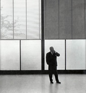
 It makes the Grauniad look like something set out by a Web 2.0 Mies Van Der Rohe, and that is difficult, G*d knows.
Parts of the Times design are just messy – misaligned grids, iffy colour schemes and so forth. Other problems include wanting to look actually like a newspaper. [Edit. And I’ve just realised, it partly uses something close to my colour scheme – obviously ressentiment kicked in on my part.]
But then worse, comments are invited on news stories but are apparently not appended to the public story post. So why comment? Or is it just an incredibly slow moderation system? [Edit. The truly lovely Tom Whitwell, who rejoices in the vaguely Orwellian title of ‘Times Online Communities Editor’, has dropped by the comments on this post to say that they are suffering a very irritating technical problem. My sympathies.]
Plus, on the day, 14 Feb 07, that I looked at this law sub section page, there were 5, yes 5 different links to the same piece, and at least 4 to another piece, spread over the three columns and header. This is just ridiculous.
Pah. Hopefully it will get better.
The comment issue is a technical problem we’re having – it’s very irritating. We had 350 comments on the Matthew Courtney story, but only 10 (at most) displaying at any one time. A few readers think we have some elaborate censorship system in place. The fix is apparently on the way in the next couple of weeks. Sorry. Tom Whitwell(Online Communities Editor)
Thanks, and I’m impressed that you are doing the rounds of the blogs to tell people. Now I feel vaguely mean. I’ve updated the post to include this.